Blacksburg's Refreshed Community Brand System
An Updated Identity
This year, the Town of Blacksburg launched an exciting initiative to update its identity and to refresh brand recognition in our community.
In March of this year, the Town partnered with Arnett Muldrow & Associates, a nationally recognized branding firm, to capture the character and spirit that make Blacksburg a welcoming, innovative, and creative place to work, study, and live.
Since March, a project team comprised of town and community stakeholders has engaged in conversations and input workshops with community groups to better identify and characterize what makes Blacksburg unique and beloved by citizens and visitors alike. Feedback on the brand direction was sourced from a wide variety of community input, including:
- A public input survey that was live for a month and collected 375 community responses from residents, property owners, workers, business owners, students, and former residents, capturing a broad community perspective.
- Over 25+ input meetings with community stakeholder groups, including tourism, housing and economic development groups, the downtown business community, regional organizations and partners, community members in the arts and culture spaces, and members of three key community organization partners: Downtown Blacksburg, Inc., Blacksburg Partnership, and Main Street Connect.
- A public engagement open house in which attendees engaged in conversations on brand direction.
The feedback gathered during this process informed the direction and style of the new brand and focuses on elevating four main brand pillars to support Blacksburg’s refreshed identity moving forward.
Brand Pillars
- College Town Energy, recognizing the intellectual curiosity, youthful energy, entrepreneurial thinking, and a culture of innovation that touches every corner of the community, and purposefully acknowledges our neighbor, Virginia Tech.
- Mountains and Outdoors, elevating the natural landscape that shapes our community and its easy integration into daily life.
- Small Town Warmth, a recognized trait Blacksburg retains despite its growing size, where neighbors know neighbors and community members support one another.

- Creative Spirit, appreciating the arts, craft, and music that weave through Blacksburg’s community fabric.
These brand pillars helped to inform Blacksburg's new color palette, reaching each of these identity touchpoints and allowing for visual flexibility and creativity within the brand. This 8-color system includes: shades of green that connect to the natural landscape; shades of blue introduce cooler tones; gold adds warmth; orange and maroon intentionally acknowledge our neighbor, Virginia Tech.
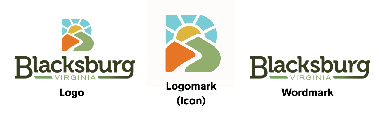
Blacksburg's new identity includes a 3-logo system, all of which may appear as the official Town logo.
- Logo: The logo is the combination of the logomark and logotype to graphically convey the identity of our community.
- Logomark (Icon): The logomark (icon) is the graphic identifying mark or symbol that does not contain the business name.
- Wordmark: The wordmark is the name of the organization only, designed in a way that can stand alone as a logo.
 A Unified Vision
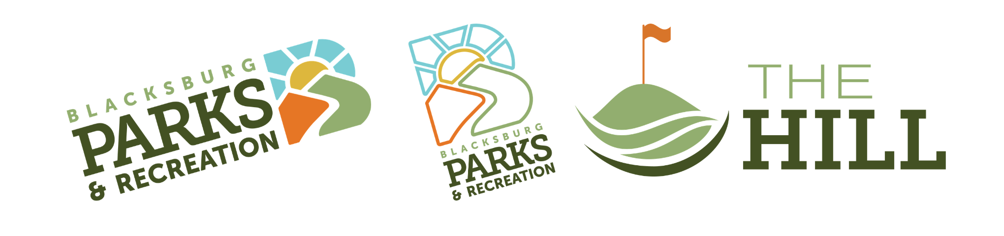
Blacksburg’s Parks and Recreation Department and one of its facilities, The Hill Golf Course, have historically utilized department-specific logos. Blacksburg’s new brand creates a cohesive, more consistent representation for the town by strengthening the visual connection between the Parks and Recreation department and the overall Town identity. Sharing the same color palette and similar icon allows Parks and Recreation to be quickly identifiable as a Town department, while retaining the flexibility, playfulness, and energy central to the work of the department.
Partner Organizations
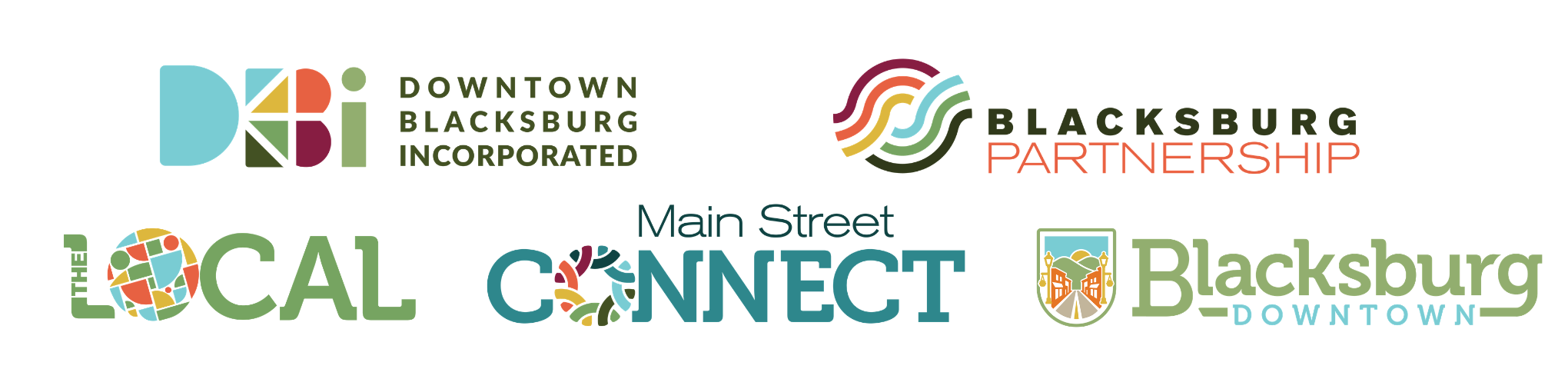
This project included coordination with key community partners to support a unified brand that extends beyond the town government. Downtown Blacksburg Inc. (DBI), which works to promote and enhance the downtown commercial district through events and marketing; Main Street Connect, an organization that represents and connects Blacksburg businesses beyond the Downtown area; and the Blacksburg Partnership, the engine that supports economic development and tourism opportunities in Blacksburg, received updated and refreshed brand identities. Using shared colors and messaging reinforces a visual continuity between the organizations and supports the holistic identity for the Town.
This initiative additionally provided a logo identity for The Local, the Town’s new retail incubator that supports small businesses, hosts community events, and serves as a hub for visitor information. Managed by DBI, The Local will serve as a physical space to help showcase the town’s refreshed, shared identity.
Background
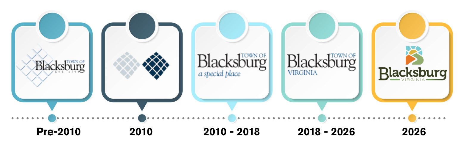
Over the past two decades, Blacksburg’s brand has evolved through several updates, while maintaining a consistent look with similar fonts, layouts, and color palettes across each version.
For many years, the town’s logo featured a distinctive design inspired by Blacksburg’s original sixteen historic squares. This visual element served as a connection to the town’s early layout and history, helping tell the story of how the community was first shaped.
During the 2010s, this historic reference continued more simply. The sixteen-square design was simplified into a standalone graphic element, separate from the main logo. During this time, a refreshed logo was also introduced, featuring the tagline “A Special Place.” This version aimed to highlight the town’s welcoming character and strong sense of community.
The most recent logo was introduced in 2018, built on these earlier efforts with a modern approach.
Today, Blacksburg’s brand appears as a refreshed version of town identity, meeting each brand pillar with an accessible, welcoming, and updated presence across many touchpoints—from the digital platforms of the town website and social media to physical signage throughout the community, and beyond.
An Updated Identity
This year, the Town of Blacksburg launched an exciting initiative to update its identity and to refresh brand recognition in our community.
In March of this year, the Town partnered with Arnett Muldrow & Associates, a nationally recognized branding firm, to capture the character and spirit that make Blacksburg a welcoming, innovative, and creative place to work, study, and live.
Since March, a project team comprised of town and community stakeholders has engaged in conversations and input workshops with community groups to better identify and characterize what makes Blacksburg unique and beloved by citizens and visitors alike. Feedback on the brand direction was sourced from a wide variety of community input, including:
- A public input survey that was live for a month and collected 375 community responses from residents, property owners, workers, business owners, students, and former residents, capturing a broad community perspective.
- Over 25+ input meetings with community stakeholder groups, including tourism, housing and economic development groups, the downtown business community, regional organizations and partners, community members in the arts and culture spaces, and members of three key community organization partners: Downtown Blacksburg, Inc., Blacksburg Partnership, and Main Street Connect.
- A public engagement open house in which attendees engaged in conversations on brand direction.
The feedback gathered during this process informed the direction and style of the new brand and focuses on elevating four main brand pillars to support Blacksburg’s refreshed identity moving forward.
Brand Pillars
- College Town Energy, recognizing the intellectual curiosity, youthful energy, entrepreneurial thinking, and a culture of innovation that touches every corner of the community, and purposefully acknowledges our neighbor, Virginia Tech.
- Mountains and Outdoors, elevating the natural landscape that shapes our community and its easy integration into daily life.
- Small Town Warmth, a recognized trait Blacksburg retains despite its growing size, where neighbors know neighbors and community members support one another.
- Creative Spirit, appreciating the arts, craft, and music that weave through Blacksburg’s community fabric.
These brand pillars helped to inform Blacksburg's new color palette, reaching each of these identity touchpoints and allowing for visual flexibility and creativity within the brand. This 8-color system includes: shades of green that connect to the natural landscape; shades of blue introduce cooler tones; gold adds warmth; orange and maroon intentionally acknowledge our neighbor, Virginia Tech.
Blacksburg's new identity includes a 3-logo system, all of which may appear as the official Town logo.
- Logo: The logo is the combination of the logomark and logotype to graphically convey the identity of our community.
- Logomark (Icon): The logomark (icon) is the graphic identifying mark or symbol that does not contain the business name.
- Wordmark: The wordmark is the name of the organization only, designed in a way that can stand alone as a logo.
A Unified Vision
Blacksburg’s Parks and Recreation Department and one of its facilities, The Hill Golf Course, have historically utilized department-specific logos. Blacksburg’s new brand creates a cohesive, more consistent representation for the town by strengthening the visual connection between the Parks and Recreation department and the overall Town identity. Sharing the same color palette and similar icon allows Parks and Recreation to be quickly identifiable as a Town department, while retaining the flexibility, playfulness, and energy central to the work of the department.
Partner Organizations
This project included coordination with key community partners to support a unified brand that extends beyond the town government. Downtown Blacksburg Inc. (DBI), which works to promote and enhance the downtown commercial district through events and marketing; Main Street Connect, an organization that represents and connects Blacksburg businesses beyond the Downtown area; and the Blacksburg Partnership, the engine that supports economic development and tourism opportunities in Blacksburg, received updated and refreshed brand identities. Using shared colors and messaging reinforces a visual continuity between the organizations and supports the holistic identity for the Town.
This initiative additionally provided a logo identity for The Local, the Town’s new retail incubator that supports small businesses, hosts community events, and serves as a hub for visitor information. Managed by DBI, The Local will serve as a physical space to help showcase the town’s refreshed, shared identity.
Background
Over the past two decades, Blacksburg’s brand has evolved through several updates, while maintaining a consistent look with similar fonts, layouts, and color palettes across each version.
For many years, the town’s logo featured a distinctive design inspired by Blacksburg’s original sixteen historic squares. This visual element served as a connection to the town’s early layout and history, helping tell the story of how the community was first shaped.
During the 2010s, this historic reference continued more simply. The sixteen-square design was simplified into a standalone graphic element, separate from the main logo. During this time, a refreshed logo was also introduced, featuring the tagline “A Special Place.” This version aimed to highlight the town’s welcoming character and strong sense of community.
The most recent logo was introduced in 2018, built on these earlier efforts with a modern approach.
Today, Blacksburg’s brand appears as a refreshed version of town identity, meeting each brand pillar with an accessible, welcoming, and updated presence across many touchpoints—from the digital platforms of the town website and social media to physical signage throughout the community, and beyond.
Questions and Comments
-
Community Relations Manager

Email kjewell@blacksburg.gov -
Business Solutions Manager

-
Project Kickoff
Blacksburg's Refreshed Community Brand System has finished this stageMarch 2026
-
Discovery & Stakeholder Engagement
Blacksburg's Refreshed Community Brand System has finished this stageMarch - April 2026
- Public Input Survey Opens: March 30
- Visit 1, April 14 - 15
- Public Engagement Meeting: Tuesday, April 14, 5:30pm - 6:30pm at the Blacksburg Community Center (725 Patrick Henry Drive)
-
Research, Concept Development & Draft Brand Platforms
Blacksburg's Refreshed Community Brand System has finished this stageMay - June 2026
- Public Input Survey Closes: May 1
- Visit 2, May 18 - 20
- Visit 3, June 9 - 11
-
Brand Launch Preparation & Training
Blacksburg's Refreshed Community Brand System has finished this stageJuly - August 2026
-
Final Deliverables Submitted
Blacksburg's Refreshed Community Brand System has finished this stageAugust 2026
-
Project Completion & Final Presentation
Blacksburg's Refreshed Community Brand System is currently at this stageSeptember 2026
-
Implementation
this is an upcoming stage for Blacksburg's Refreshed Community Brand SystemFall 2026

-
 Click here to play video
Blacksburg Brand Launch
Click here to play video
Blacksburg Brand Launch
Thank you for your contribution!
Help us reach out to more people in the community
Share this with family and friends